Elements

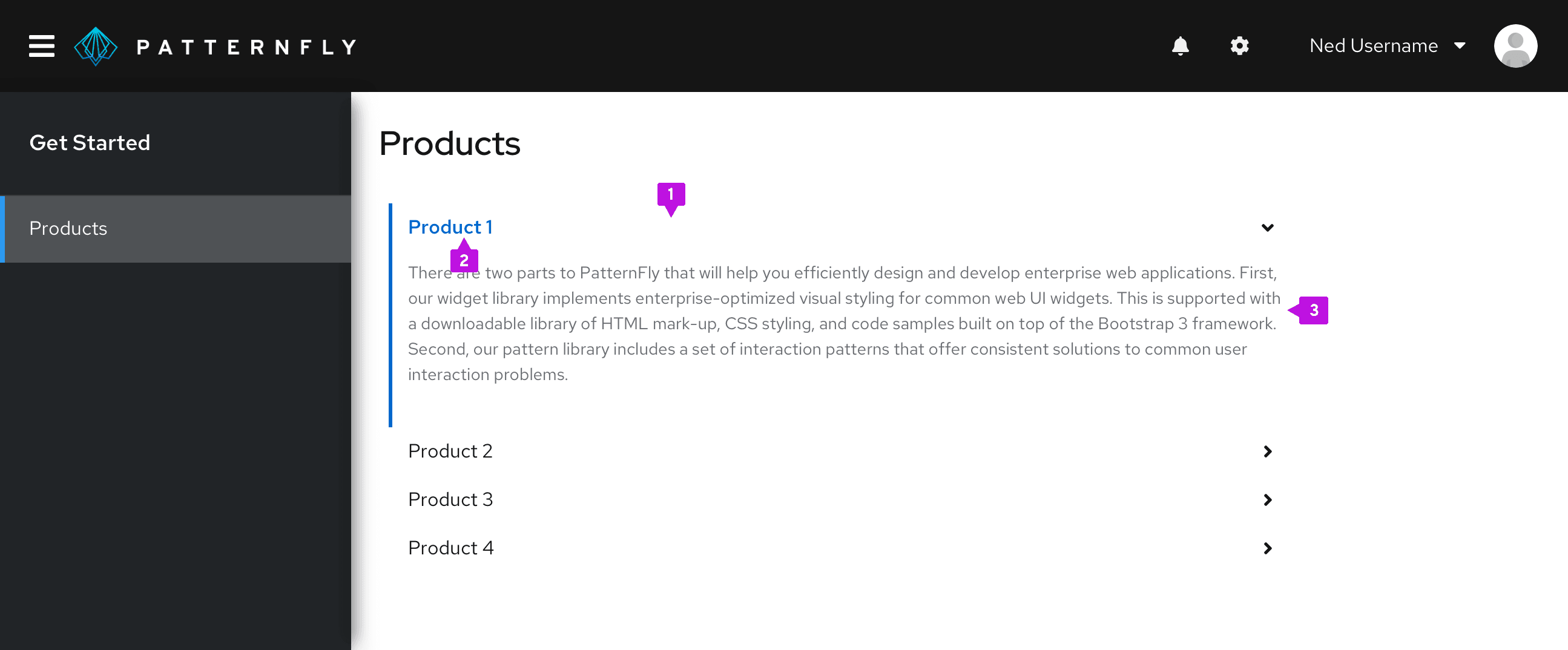
- Header: Interactive link that expands or collapses to reveal the nested content.
- Label: Summary descriptions of the nested content.
- Content panel: Area that holds the information associated with the header.
Usage
Accordions are one of many ways to organize large amounts of content when there is limited space. It provides a grouping structure while the header title gives an overview of the content hidden underneath it. Due to their high interaction cost, we recommend that you use accordions sparingly when you need an additional layer of structure to your content.
Behavior
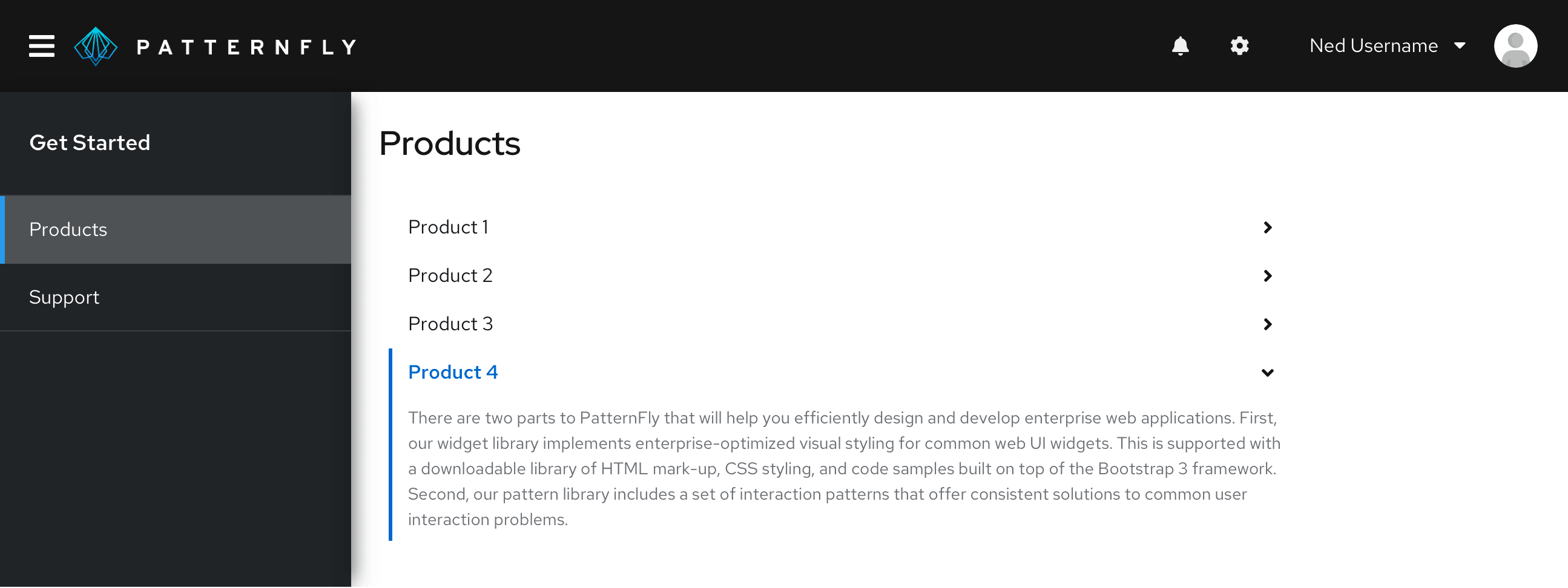
Users click or tap on section header of collapsed accordion and content area will expand.
Variations
Single expand behavior: Use when you are trying to bring focus to a single row at a time, by default the first row is always open. This is ideal for content that is mutually exclusive and doesn’t all need to be shown at once. Single expand accordions are particularly useful when working with forms, navigation and subnavigation.

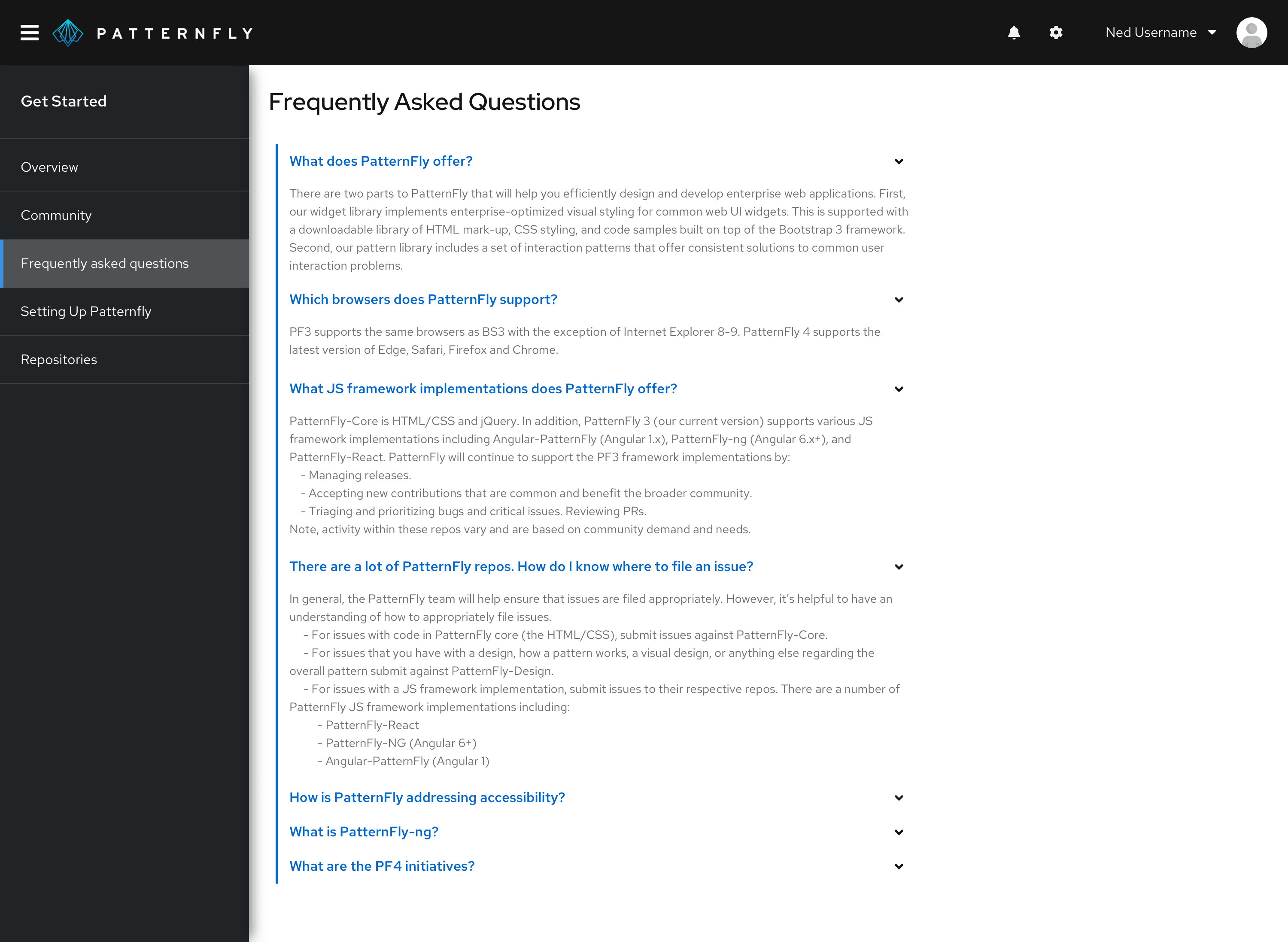
Multiple expand behavior: Use when users may want to view content from different sections simultaneously. This variation gives users the ability to open multiple rows at a time, content will expand or collapse per each interaction. This variation is frequently used in FAQ sections and product comparisons.

Accessibility
For information regarding accessibility, visit the accordion accessibility tab.
