PatternFly's palette
Our color palettes align with Red Hat's brand colors and are designed to reinforce content and support effective communication across different UI needs. Colors are applied to PatternFly elements using semantic design tokens. This guide offers guidance for color use in some of the most common scenarios, but it does not cover all tokens. Additional color usage information is included in our tokens documentation.
Each example contains a descriptive label, a semantic token, and a color swatch circle. If you select a color swatch circle, you can see more details, including a hex code and usage information. Color swatches will automatically update to match light or dark theme colors, based on your browser settings.
Brand colors
Brand colors are used to identify your brand, and are the colors most frequently used across your UI. Our brand color, "PatternFly blue", is used across all components. There are different brand tokens depending on the use case, like icon tokens, text tokens, global color tokens, and so on.
Default
--pf-t--global--color--brand--defaultHover
--pf-t--global--color--brand--hoverText
--pf-t--global--text--color--brand--default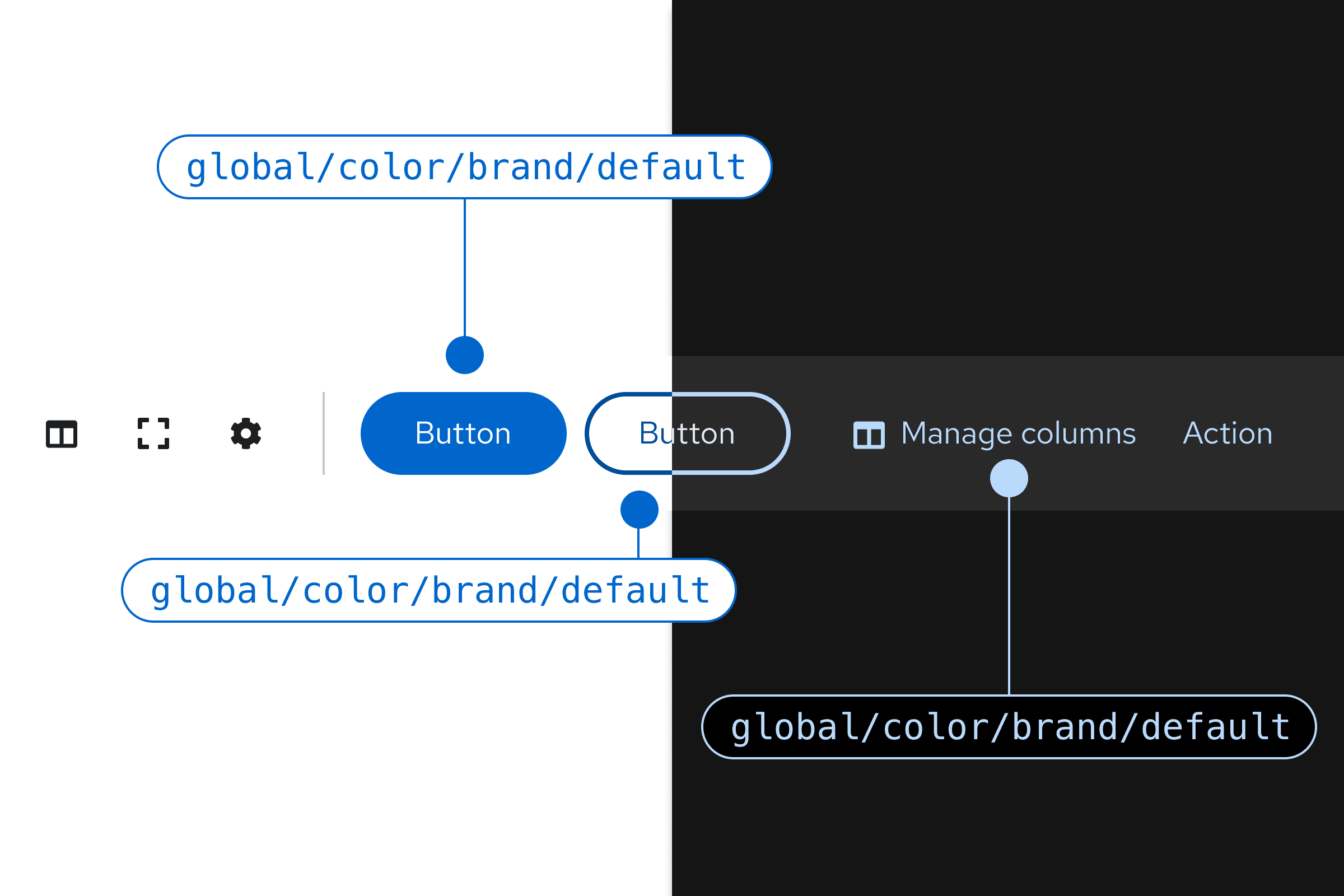
Background colors
Background colors are used throughout components and, occasionally, for certain screens.
Primary
--pf-t--global--background--color--primary--defaultPrimary hover
--pf-t--global--background--color--primary--hoverSecondary
--pf-t--global--background--color--secondary--defaultSecondary hover
--pf-t--global--background--color--secondary--hover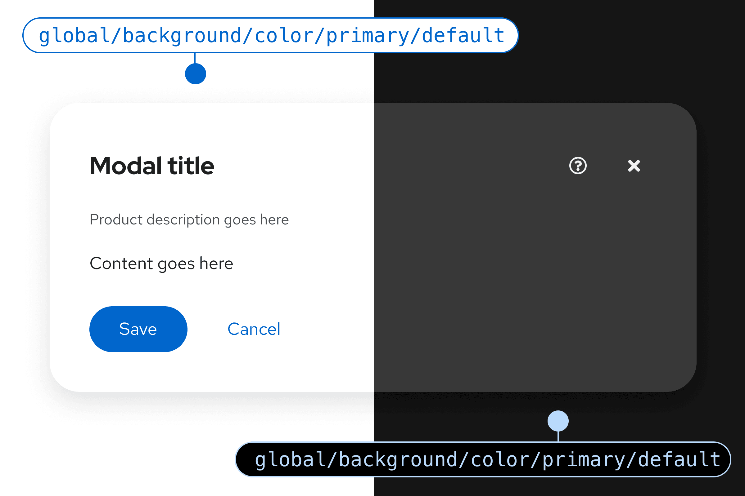
Text and icon colors
Text and icon colors overlap, because they can be used inline with each other. Note that there are different tokens for standalone icons, inline icons, and standalone text. For more details view our icons and typography guidelines.
Text and icons can also display status information, which is covered in the status and state colors section.
Regular text
--pf-t--global--text--color--regularSubtle text
--pf-t--global--text--color--subtleRegular icons
--pf-t--global--icon--color--regularLinks
--pf-t--global--text--color--link--default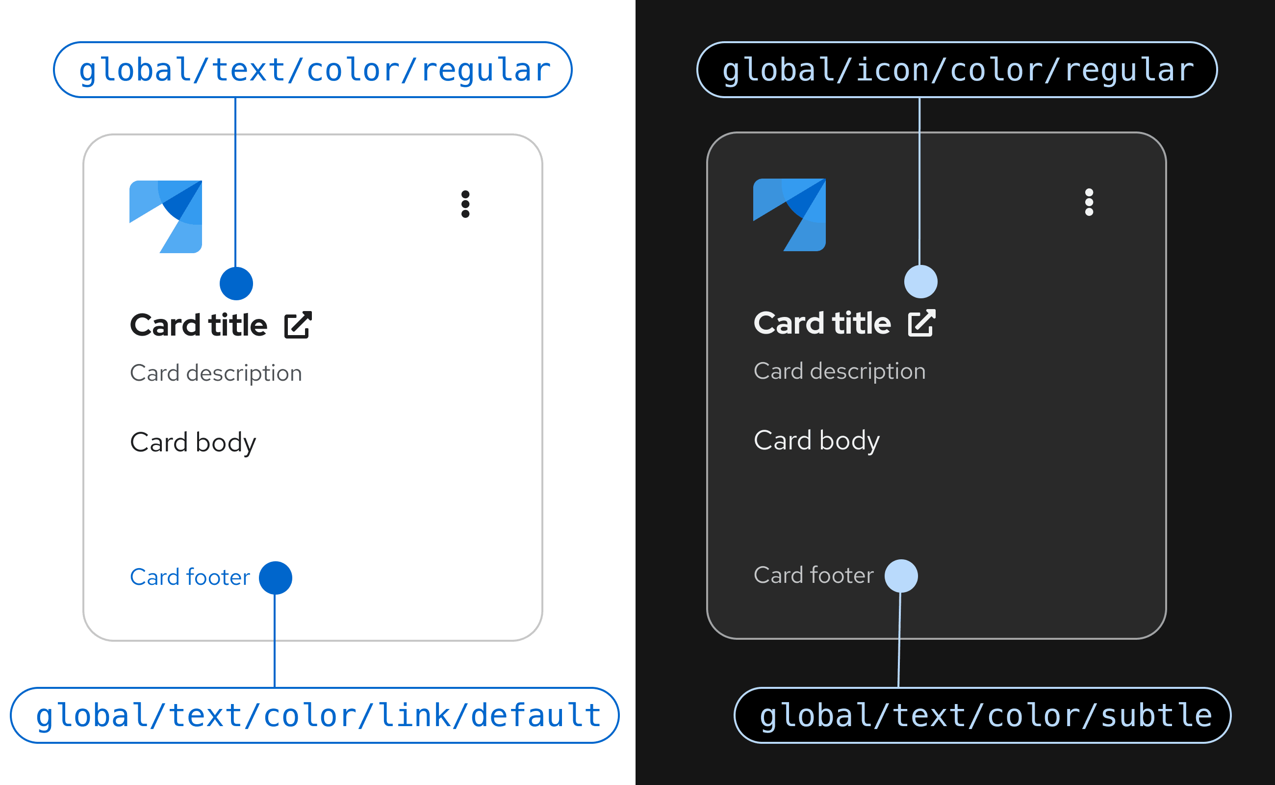
Status and state colors
Status and state colors are indicators that communicate data and actions to users through the UI. PatternFly's status colors cover default, danger, success, information, and warning statuses, as well as disabled states.
Danger
Default icons
--pf-t--global--icon--color--status--danger--defaultDefault text
--pf-t--global--text--color--status--danger--defaultHover
--pf-t--global--color--status--danger--hover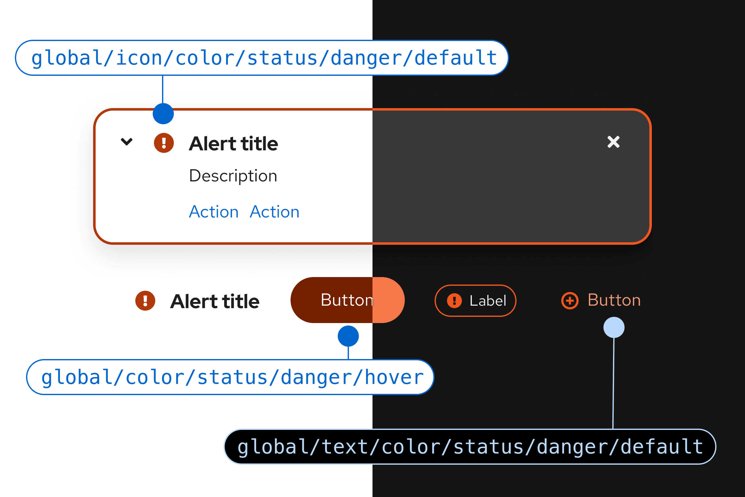
Warning
Default icons
--pf-t--global--icon--color--status--warning--defaultDefault text
--pf-t--global--text--color--status--warning--defaultHover
--pf-t--global--color--status--warning--hover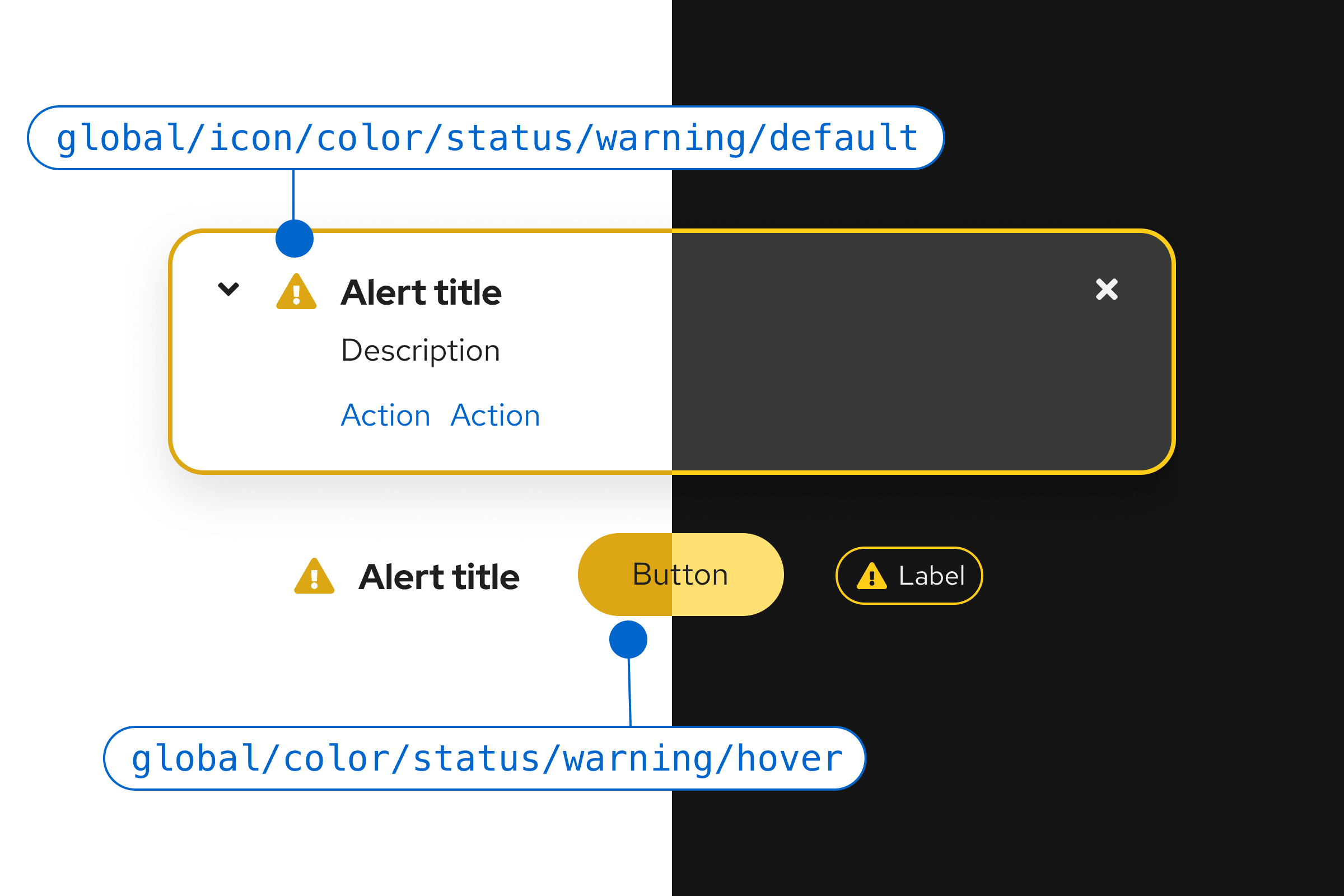
Disabled
Icons
--pf-t--global--icon--color--disabledText
--pf-t--global--text--color--disabledBackgrounds
--pf-t--global--background--color--disabled--default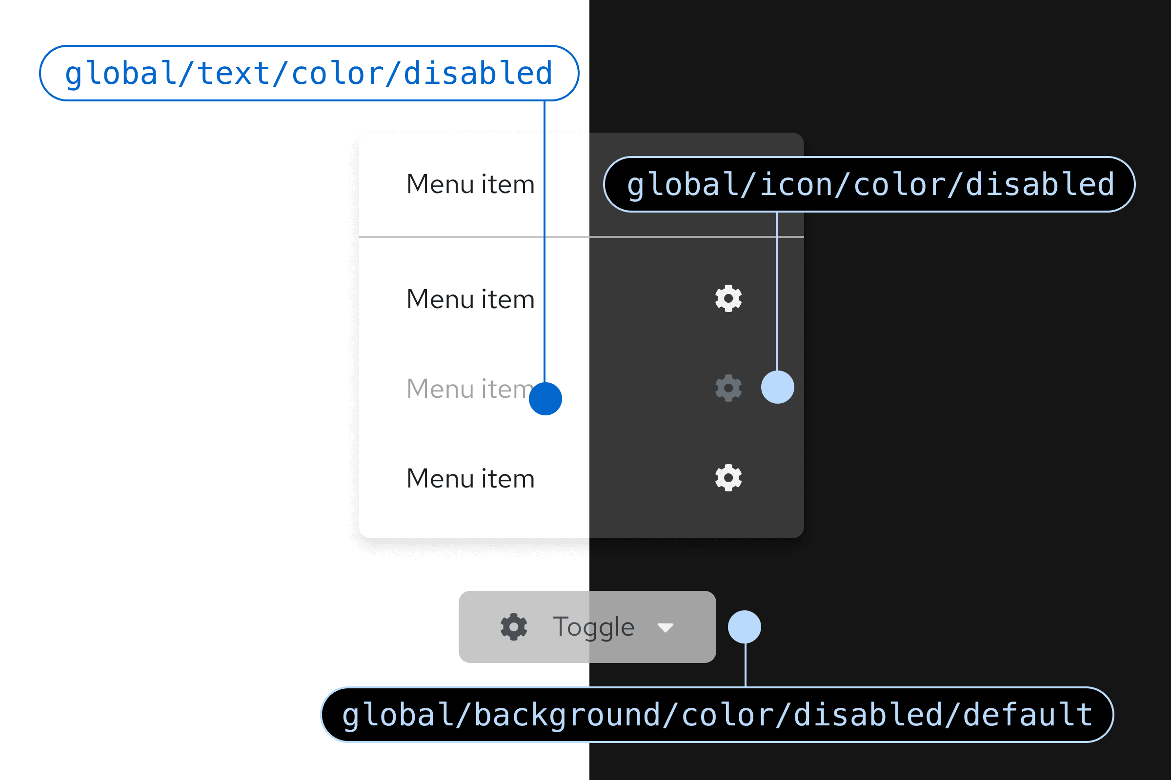
Nonstatus colors
Borders
--pf-t--global--border--color--nonstatus--teal--defaultBackgrounds
--pf-t--global--color--nonstatus--purple--defaultHover
--pf-t--global--color--nonstatus--green--hover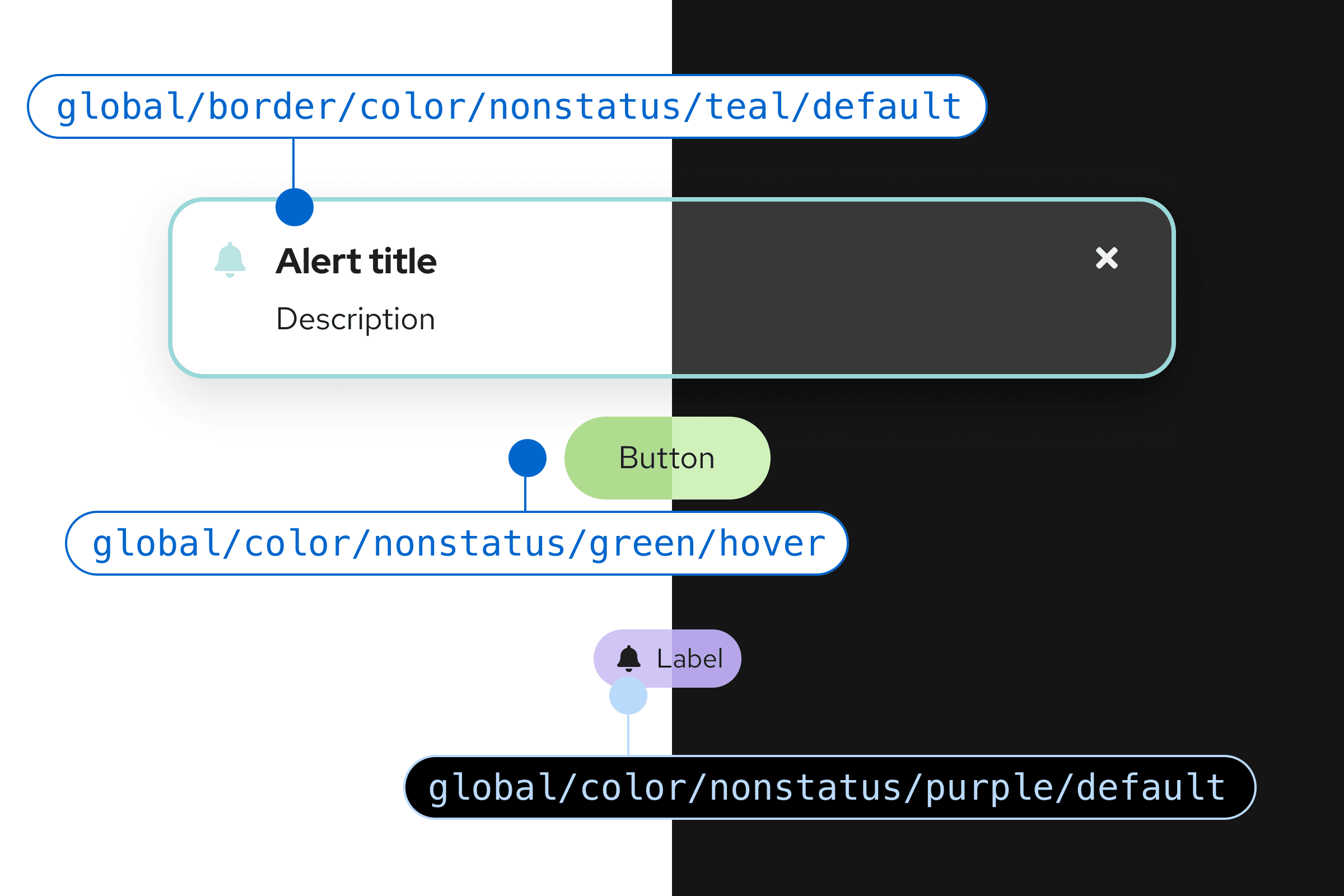
Contrast ratios
Our goal is for PatternFly to meet level AA requirements in the Web Content Accessibility Guidelines 2.1. To achieve level AA accessibility, your UI contrast ratios must be at or above 4.5:1 for normal text, 3:1 for large text, and 3:1 for graphics and other UI components. Additionally, on hover, link text color should have ample contrast from both the background color and the default state link color.
To check the contrast between background and text colors, use a WCAG AA-compliance tool.
Color families
Our color palettes are organized into "families" that contain different shades of the same hue. In the following families, you can expand each color to see related tokens.
